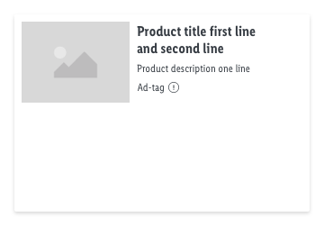
Ad-tag
Ad-tag component shows to the user that certain component is used for advertising purpose. It is part of legal requirements for advertisements.
Overall styling#
- The text-style is small.
- The line-height is set to default.
- The color is set to gray-darker.
Ad-tag#
- The symbol has a general basic-white background for image advertisements.
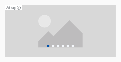
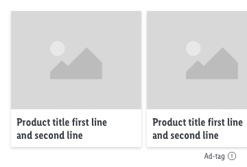
- The background can be changed to the transparent background when it is placed below a component, e.g. recommendation slider.
- The ad-tag with transperency background works only on light backgrounds such as e.g gray-background.
- The expression exclamation-circle icon is optional and can trigger a modal view/sheet.
- The text-length is limited to a single word only.
- The whole area of ad-tag is interactive.
| Size | Attributes | Preview | Variants |
|---|---|---|---|
| MD-XS | text-color: gray-darker icon-color: gray-darker background-color: basic-white or transparent |  |  |
Spacing & measurements#
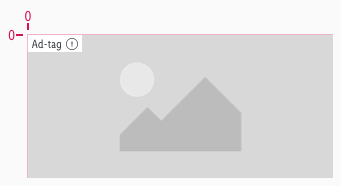
- The ad-tag is placed on the top left area of the hero slider and is left aligned.
Measurements#
| Types | Attributes | Preview |
|---|---|---|
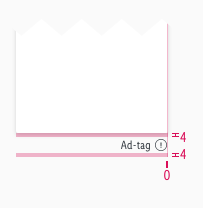
| Horizontal spacing | padding: 4px |  |
| Vertical spacing | padding-top: 0px icon is vertical centered |  |
| Height | MD-XS: 17px |  |
| Size | icon: 12x12px |
Spacing#
Examples#
Our workflow in Sketch#
- Use the "Overrides"-function to customize your ad-tag symbol (i.e. enter text, with-icon or none icon, choose background color).
