Carousel
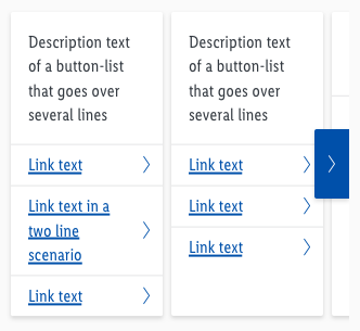
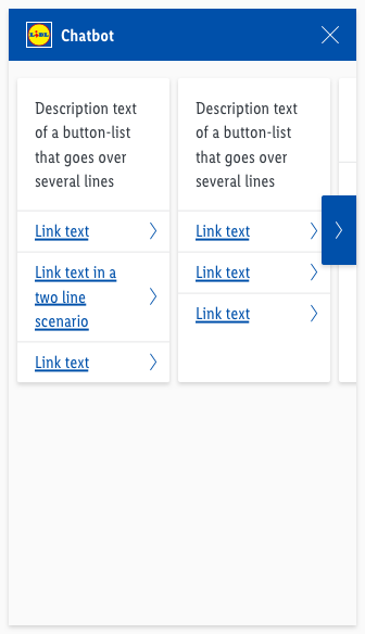
The carousel is a possible responding option to offer the user a summary of respond blocks at the same time.
General information#
- All offers are listed horizontally next to each other.
- Sliding offers is a characteristic feature of this components.
- The carousel contains a various number of respond blocks (e.g. button list, card etc.).
- The overall height depends on the highest element.
Usage#
- By clicking on the button of the carousel the user can switch through all block elements.
- Alternativ he can swipe the carousel to see the different blocks.
Overall styling#
- The background-color is brand-primary-base.
- The icon-color is basic-white.
- It uses the shadow-default.
- The component has rounded corners of 2px on one side.
- The button has no hover/focus or active state. Only the pointer changes.
Spacing & measurements#
| Types | Attributes | Preview |
|---|---|---|
| Height | 64px |  |
| Width | 32px |  |
| Horizontal spacing | padding: 8px |  |
| Icon size | 16x16px | |
| Rounded corners | 2px No rounded corners at the screen edge |   |
Placement & spacing#
- The buttons are placed on the edge of the screen.
- The buttons are placed in mid-level hight of the highest element.
- Padding of 8px between the elements.
- The overall height depends on the highest element.
What can be modified?#
- Override the text elements.
- Adjust the height.
- Add or delete the amount of links.
- Add ordered list or line break list in the text box area.
Change log#
2.0.0 Chat - 2021-07-22#
Highlights#
Sketch,Doc: "Carousel" | New layer-styles, text-styles and color-variables settings
Changed#
Doc: "Carousel" | Clean up the documentation for the right structure and sentence case
Fixed#
- "Carousel" | Fixed assets: wrong example images

