Card
The card is a possible respond option of the chatbot to offer the user information to his question.
It is based on the design of the CAKE product tile.
General information#
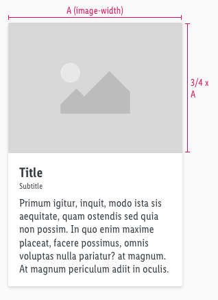
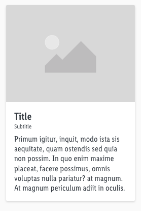
- The card offers image, title, subtitle and body-text to give the user necessary information about a certain topic.
Overall styling#
- The text-style of the title is large bold.
- The line-height is 120%.
- The text-style of the subtitle is small.
- The text-style of the body-text is basic.
- The image ratio always is 4:3.
- The components has rounded corners of 2px.
- Every state uses the shadow-default.
- The height depends on the content.
- The width is fixed and aligned to the layout grid of the breakpoints.
Spacing & measurements#
| Types | Attributes | Preview |
|---|---|---|
| Image size | Always ratio 4:3 |  |
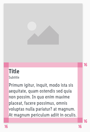
| Padding | 16px |  |
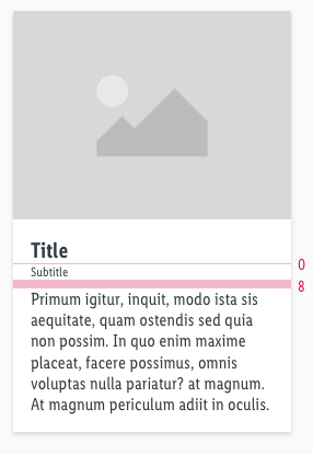
| Vertical spacing | Title to subtitle: 0 px Subtitle to Text: 8 px |  |
What can be modified?#
- Override the text and image.
- Modify card component to your project needs.
- Adjust the height.
Change log#
2.0.0 Chat - 2021-07-22#
Highlights#
Sketch,Doc: "Card" | New layer-styles, text-styles and color-variables settings
Changed#
Doc: "Card" | Clean up the documentation for the right structure and sentence case
Fix#
Doc: "Card" | Fixed links
