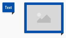
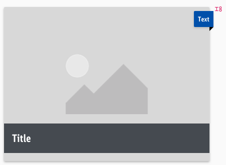
Ribbons
Use ribbons to add unique selling prepositions or other information.
Basically it is positioned in a context with a teaser or image.
Overall styling#
- The text style is small bold.
- The line height is 120%.
- The image has a free-ratio.
- The color of the triangle always is gray-darker.
- The background-shadow is shadow-default.
- The background has rounded corners of 2px on the upper- & lower-left.
Recommendations#
- If you decide to use a ribbon, never use more than a maximum of 2 variations
(our "info" ribbon matches our brand-primary color due to the purpose of the color "blue"). - At best, the width of the ribbon should not overlap more than 50% of the underlying element.
Variants#
- The ribbon has 4 colored variations: primary, highlight, gray and info.
- And can be used to show 2 different contents: text and image.
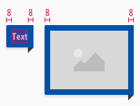
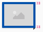
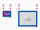
Spacing & measurements#
Desktop (LG)#
Tablet & smartphone (MD-XS)#
Position#
- A ribbon takes its place at the upper right corner.
- The distance of the first ribbon on an element to the upper edge is 8px.
- Several ribbons have no distance to each other at the bottom.
What can be modified?#
- Override the text and image.
- Adjust the height and width according to the text.
- Adjust the height and width according to the image ratio.
- Modify ribbons to your project needs by changing the content to another element (i.e. to an icon or an icon with text).
Change log#
Changed#
Doc: "Ribbon" | Updated documentation preview assets
Changed#
Doc: "Ribbon" | Clean up the documentation for the right structure and sentence case
Changed#
- "Ribbon" | Changed symbols: with layer-style settings
Changed#
- "Ribbon" | Changed symbols of ribbon/image: naming from "01-info-primary" to "01-primary"
