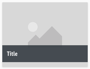
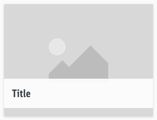
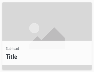
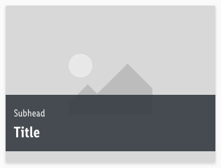
Teaser
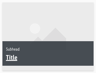
Use the teaser component to attract attention and build excitement and expectations through curiosity.
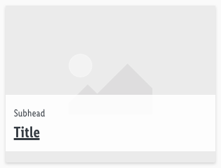
It consists of an image and a text to underline the visual meaning.
Recommendations#
- Always use the text in a single line scenario.
- If you select a teaser with text, look at it’s contrast to the picture – i.e. choose gray for an image with a bright subject and vice versa.
- Try to keep the 4:3 ratio for teasers to guarantee the right display in each breakpoint.
- Otherwise it’s ratio is completely free adjustable.
Overall styling#
- The components has rounded corners of 2px.
- It uses the shadow-default.
States#
- The change of state is mainly shown in the bar and overlay of the image.
- The title gets underlined and the image gets an overlay of basic-white with 50% opacity.
Bars#
- The title uses the text-style large bold.
- The subhead comes in the text-style small.
- The line-height is set to default.
- The background-color always has an opacity of 90%.
| Types | Attributes | Preview |
|---|---|---|
| Gray | text-color: basic-white background: gray-darker | 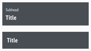 |
| White | text-color: gray-darker background: basic-white | 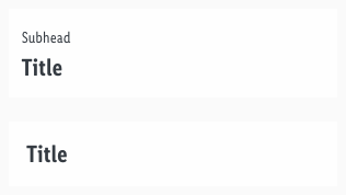 |
Spacing & measurements#
| Types | Attributes | Preview |
|---|---|---|
| Horizontal spacing | padding: 16px | 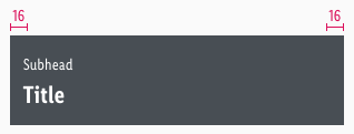 |
| Vertical spacing | padding: 16px distance: 2px |  |
| Spacing | margin-bottom: 16px | 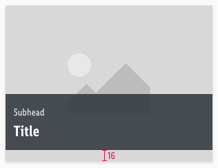 |
| Size | default size of 4:3 |  |
What can be modified?#
- Override the text and bars.
- Adjust the ratio to any size but please try to stick to a 4:3-ratio.
Our workflow in Sketch#
- Use the "Overrides" function to customize the teaser in the three possible variants (for example, select "None" for the bar element to display just an image teaser).
Change log#
Changed#
Sketch: "Teaser" | Adjusted to new grid settings
Changed#
Sketch: "Teaser" | Adapted component to new grid settings
Changed#
Doc: "Teaser" | Clean up the documentation for the right structure and sentence case
Changed#
- "Teaser" | Changed symbols: with layer-style settings
Fixed#
- "Teaser" | Fixed symbols: overrides function and bar settings
Fixed#
- "Teaser" | Fixed symbols: line height and height of bars
Changed#
- "Teaser" | Changed symbols to new smart layout of Sketch
