Floating action button
A sticky button that floats over the content of an screen. It always has the highest level of emphasis on the screen.
It supports the primary navigation and offers the user a fast option to navigate. There are two types of floating action buttons and they look the same in dark and light modes.
Recommendations#
Do's#
- Please ensure that the floating action button has a positive function (e.g. open a menu, share, more, etc.).
- Choose an icon that refers to the content behind the interaction with the button.
- Use the floating action button only once per site.
- Use the button efficiently in the layout. Content such as image galleries, shopping basket, etc. does not suit the floating action button.
Dont's#
- Don’t overlay the floating action button with additional elements like badges.
- Don’t use the floating action button for negative functions (e.g. delete).
- Don’t change the shape of the floating action button.
Overall styling#
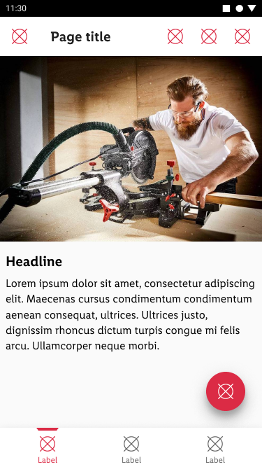
- The regular type component always comes in the shape of a circle.
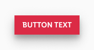
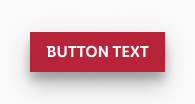
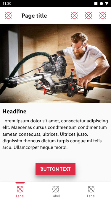
- The extended type component always comes in the shape of a rectangle.
- For the extended type the button-text style. The alignment is always center.
- It uses the shadow android-light-mode 16dp.
Spacing & measurements#
| Types | Attributes | Preview |
|---|---|---|
| regular shape | 56x56px | 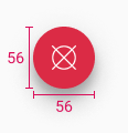 |
| regular icon size | 24x24px | |
| extended height | 40px | 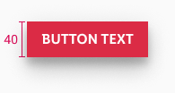 |
| extended vertical-spacing | 10px | 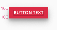 |
| extended horizontal-spacing | 16px | 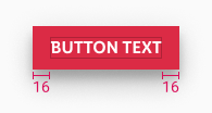 |
Position & usage#
- The optimal position for the regular floating action button is the lower right corner.
- The optimal position for the extended floating action button is in the lower middle area.
- This area is easily reachable for the user.
What can be modified?#
- Change the icon.
- The width of the extended floating action button.
- Check the recommendations of this component.


