Layout grid system
A layout grid system can be used to align and size objects within a given frame. It provides visual structure and align objects. Layout grids establish consistency across multiple platforms.
Usage#
- Basic rules that help you set up your frames in Figma.
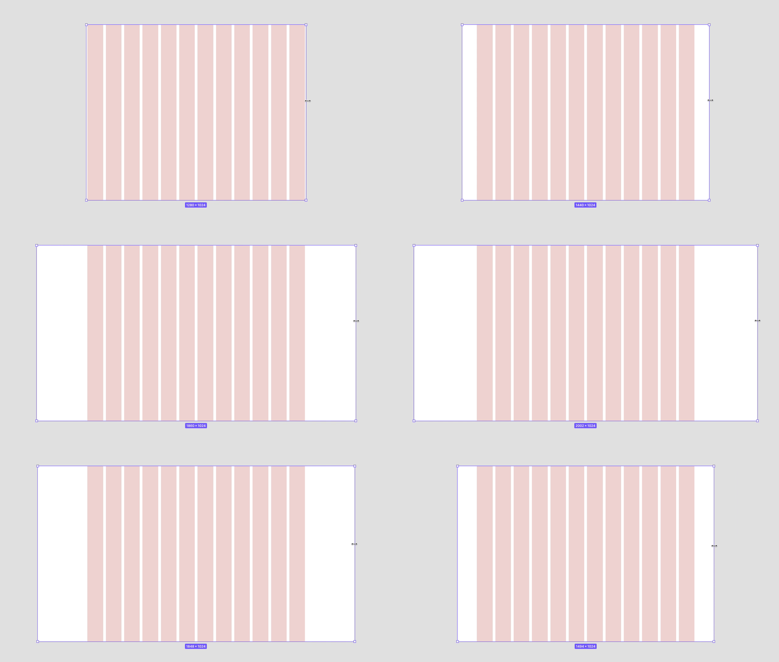
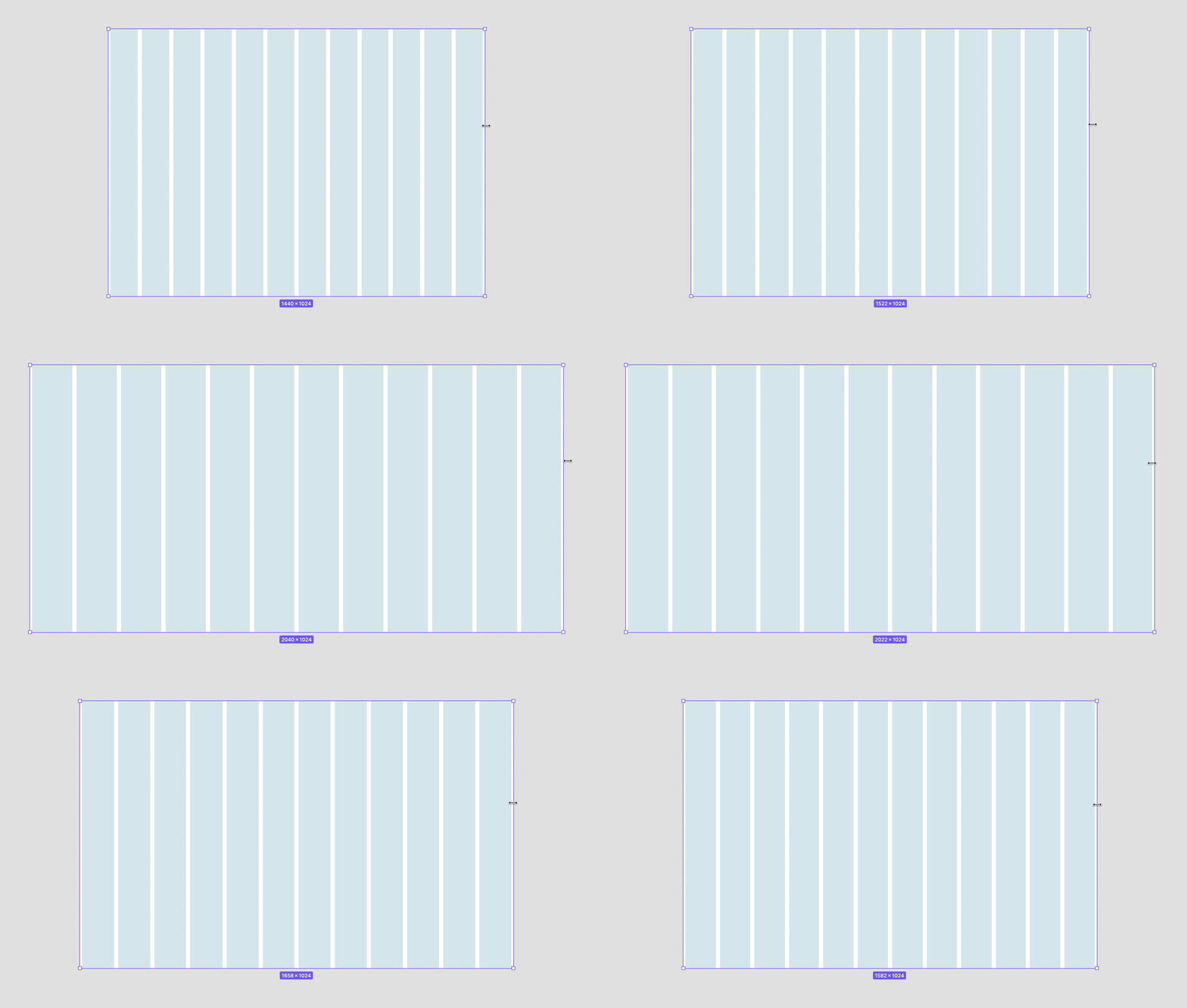
- The responsive behavior of our grid has four breakpoints.
- The amount, width and spacing of the columns change with each breakpoint.
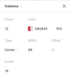
- We do have three layout grid properties available.
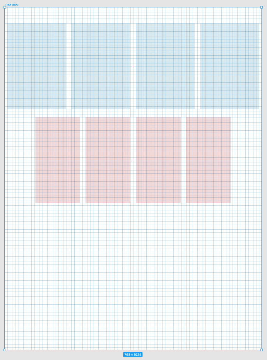
- 8pt grid
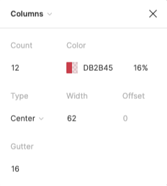
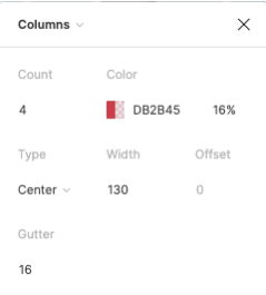
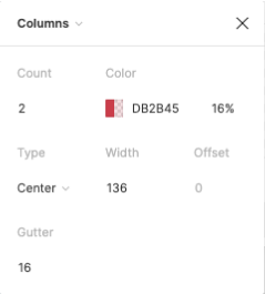
- Column grid center
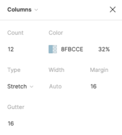
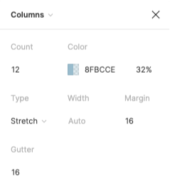
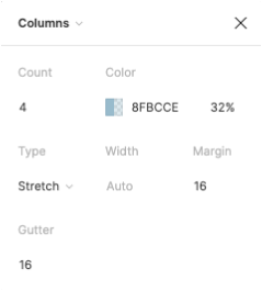
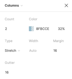
- Column grid stretch
| 1. Columns | 2. Gutters | 3. Margins |
|---|---|---|
| Content is placed in the areas of the screen that contain columns. The number of displayed columns is determined by the breakpoint that is chosen. | Gutters are the spaces between columns. They help separate content. | Margins are the space between content and the left and right edges of the screen. |
Layout grid properties in Figma#
Change log#
2.0.0 Parkside - 2021-11-02#
Changed#
Doc,Figma: "Grid" | Changed the current margin from 8px to 16px

