Typography

The LIDL Font was developed for the various topics and applications of LIDL's brand communication and represents the core brand values for PARKSIDE on a typographical level.

It helps you to present your design and content as clearly and effectively as possible in accordance with digital PARKSIDE styleguide.


LIDL Font Condensed Pro#

  • It looks informative, useful and efficient.
  • In combination it represents the variety of topics and actions, and at the same time is 100% PARKSIDE.
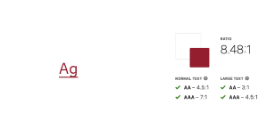
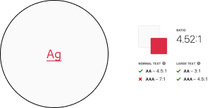
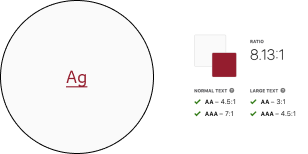
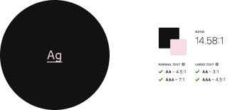
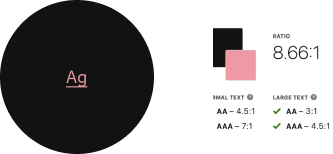
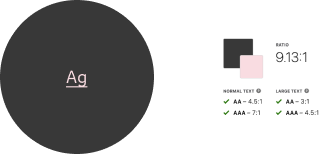
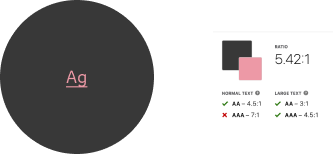
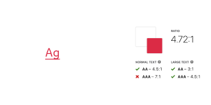
  • Use any base color of high-contrast or medium-contrast, as text color as long as it has a high contrast ratio in interaction with backgrounds.
  • We follow the Web Content Accessibility Guidelines (WCAG), which are a series of recommendations for making the web more accessible. Regarding color contrast, the AA level is our standard.
  • All types of headings should primarily be used in single line scenarios.
  • Capital letters are not allowed. The only exceptions are buttons.
☀ Light mode☾ Dark mode
Regular
Font-color:
greyscale/light-mode/high-contrast
greyscale/light-mode/medium-contrast
Regular
Font-color:
greyscale/dark-mode/high-contrast
greyscale/dark-mode/medium-contrast
Semibold
Font-color:
greyscale/light-mode/high-contrast
greyscale/light-mode/medium-contrast
Semibold
Font-color:
greyscale/dark-mode/high-contrast
greyscale/dark-mode/medium-contrast
Bold
Font-color:
greyscale/light-mode/high-contrast
greyscale/light-mode/medium-contrast
Bold
Font-color:
greyscale/dark-mode/high-contrast
greyscale/dark-mode/medium-contrast
 TypefaceText-styleUsage
Regular and Bold Small, Basic, LargeFor body text, links, tables, lists, input-fields, etc.
SemiboldSmall Bold, Basic Bold, Large Bold, Headlines, Displays, Button textFor headlines, labels, highlights, etc.

Button text#

  • The text-style is only used in our button component.
  • The typeface is always semibold.
  • The line-height is 120%.
  • The button text should be center aligned.
BreakpointFont size PreviewModeAlign-leftAlign-centerAlign-right
LG18pxButton text☀ ☾--
MD-XS16pxButton text☀ ☾--

Basic#

  • The typeface is always regular.
  • The line-height is 140%.
BreakpointFont sizePreviewModeAlign-leftAlign-centerAlign-right
LG18pxbasic regular (LG)☀ ☾
MD-XS16pxbasic regular (MD-XS)☀ ☾

Basic bold#

  • The typeface is always bold.
  • The line-height is 140%.
BreakpointFont sizePreviewModeAlign-leftAlign-centerAlign-right
LG18pxbasic bold (LG)☀ ☾
MD-XS16pxbasic bold (MD-XS)☀ ☾

Displays#

  • The typeface is always semibold.
  • The line-height is 120%.
  • The display text-style is defined in 5 levels.
  • All levels have different font sizes.
  • There are fixed font sizes from level 1 to level 5.

Display (Level 1)#

BreakpointFont sizePreviewModeAlign-leftAlign-centerAlign-right
LG56pxdisplay 1 (LG)☀ ☾--
MD-XS32pxdisplay 1 (MD-XS)☀ ☾--

Display (Level 2)#

BreakpointFont sizePreviewModeAlign-leftAlign-centerAlign-right
LG52pxdisplay 2 (LG) ☀ ☾--
MD-XS28pxdisplay 2 (MD-XS)☀ ☾--

Display (Level 3)#

BreakpointFont sizePreviewModeAlign-leftAlign-centerAlign-right
LG48pxdisplay 3 (LG) ☀ ☾--
MD-XS24pxdisplay 3 (MD-XS)☀ ☾--

Display (Level 4)#

BreakpointFont sizePreviewModeAlign-leftAlign-centerAlign-right
LG44pxdisplay 3 (LG) ☀ ☾--
MD-XS20pxdisplay 3 (MD-XS)☀ ☾--

Display (Level 5)#

BreakpointFont sizePreviewModeAlign-leftAlign-centerAlign-right
LG40pxdisplay 3 (LG) ☀ ☾--
MD-XS16pxdisplay 3 (MD-XS)☀ ☾--

Headlines#

  • The typeface is always semibold.
  • The line-height is 120%.
  • The page headlines are displayed in 5 levels.
  • All levels have different font sizes.
  • There are fixed font sizes from level 5 to level 1.

Headline (Level 1)#

BreakpointFont sizePreviewModeAlign-leftAlign-centerAlign-right
LG34pxheadline 1 (LG)☀ ☾--
MD-XS32pxheadline 1 (MD-XS)☀ ☾--

Headline (Level 2)#

BreakpointFont sizePreviewModeAlign-leftAlign-centerAlign-right
LG30pxheadline 2 (LG) ☀ ☾--
MD-XS28pxheadline 2 (MD-XS)☀ ☾--

Headline (Level 3)#

BreakpointFont sizePreviewModeAlign-leftAlign-centerAlign-right
LG26pxheadline 3 (LG) ☀ ☾--
MD-XS24pxheadline 3 (MD-XS)☀ ☾--

Headline (Level 4)#

BreakpointFont sizePreviewModeAlign-leftAlign-centerAlign-right
LG22pxheadline 4 (LG) ☀ ☾--
MD-XS20pxheadline 4 (MD-XS)☀ ☾--

Headline (Level 5)#

BreakpointFont sizePreviewModeAlign-leftAlign-centerAlign-right
LG18pxheadline 5 (LG) ☀ ☾--
MD-XS16pxheadline 5 (MD-XS)☀ ☾--

Large#

  • The typeface is always regular.
  • The line-height is 140%.
BreakpointFont sizePreviewModeAlign-leftAlign-centerAlign-right
LG22pxlarge regular (LG)☀ ☾
MD-XS20pxlarge regular (MD-XS)☀ ☾

Large bold#

  • The typeface is always bold.
  • The line-height is 140%.
BreakpointFont sizePreviewModeAlign-leftAlign-centerAlign-right
LG22pxlarge bold (LG)☀ ☾
MD-XS20pxlarge bold (MD-XS)☀ ☾

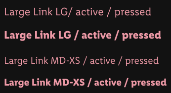
Link#

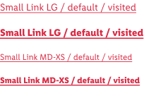
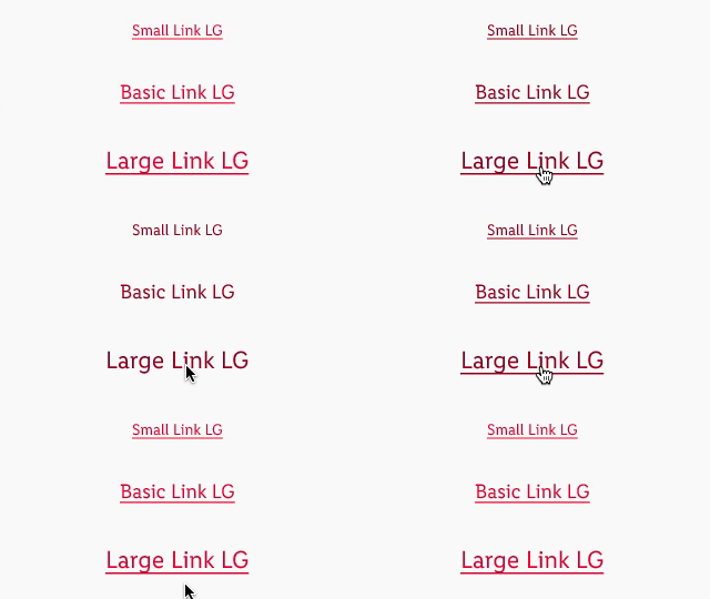
A reference for the user that can lead directly to an external or internal destination by clicking or tapping on it.

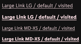
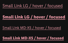
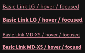
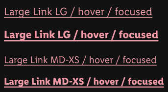
Link preview

Overall styling#

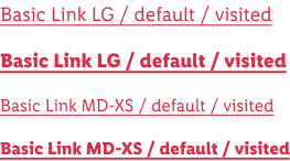
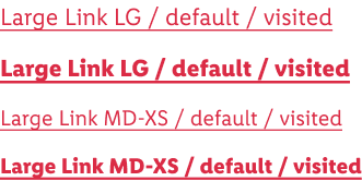
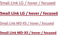
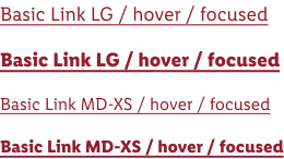
  • The text-style depends on the body text and is either small, small-bold, basic, basic-bold, large or large-bold.
  • The line-height is set to default.
  • A link can have multiple states: default/visited, hover/focus, active/pressed.
  • The appearance of the state depends on the usage or context.
  • There’s a light-mode and dark-mode version available to layout on a light or a dark background.
  • Icons can only be placed before the link.

Recommended color combinations#

ColorPreviewMode
text-color: brand-primary-base
background-color: greyscale/light-mode/light-1
combination
text-color: brand-primary-darker
background-color: greyscale/light-mode/light-1
combination
text-color: brand-primary
background-color: greyscale/light-mode/light-2
combination
text-color: brand-primary-darker
background-color: greyscale/light-mode/light-2
combination
text-color: brand-primary-lighter
background-color: greyscale/dark-mode/background/Android/00dp
combination
text-color: brand-primary-light
background-color: greyscale/dark-mode/background/Android/00dp
combination
text-color: brand-primary-lighter
background-color: greyscale/dark-mode/background/Android/24dp
combination
text-color: brand-primary-light
background-color: greyscale/dark-mode/background/Android/00dp
combination

Link on ☀ light mode#

  • Use this version if you want to display a link on a light background.
StateAttributesSmall, small-boldBasic, basic-boldLarge, large-bold
Font-sizeLG 14px LG 18pxLG 22px
Font-sizeMD-XS 12px LG 16pxLG 20px
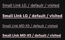
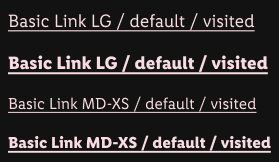
Default / visited text-color: brand-primary-base
text-decoration: underline
default/visiteddefault/visiteddefault/visited
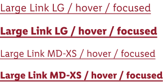
Hover / focustext-color: brand-primary-darker
text-decoration: underline
hover/focushover/focushover/focus
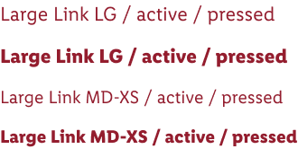
Active / pressedtext-color: brand-primary-darkeractive/pressedactive/pressedactive/pressed

Link on ☾ dark mode#

  • Use this version if you want to display a link on a dark background (e.g Android background 00 dp).
StateAttributesSmall, small-boldBasic, basic-boldLarge, large-bold
Font-sizeLG 14px LG 18pxLG 22px
Font-sizeMD-XS 12px LG 16pxLG 20px
Default / visited text-color: brand-primary-base-lighter
text-decoration: underline
default/visiteddefault/visiteddefault/visited
Hover / focustext-color: brand-primary-light
text-decoration: underline
hover/focushover/focushover/focus
Active / pressedtext-color: brand-primary-lightactive/pressedactive/pressedactive/pressed

Lists#

  • Lists are used for text structuring.
TypeAttributesPreviewMode
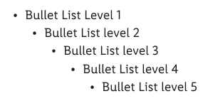
BulletsBulletpoints are special text characters whose form depends on the system.
Size and color depend on the font style of the copy text.
 lists: bullet☀ ☾
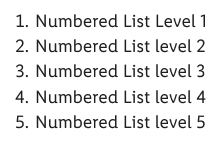
NumberedNumbers are text characters of the font.
Size and color depend on the font style of the copy text.
lists: numbered☀ ☾

Small#

  • The typeface is always regular.
  • The line-height is 140%.
BreakpointFont sizePreviewModeAlign-leftAlign-centerAlign-right
LG14pxsmall regular (LG)☀ ☾
MD-XS12pxsmall regular (MD-XS)☀ ☾

Small bold#

  • The typeface is always bold.
  • The line-height is 140%.
BreakpointFont sizePreviewModeAlign-leftAlign-centerAlign-right
LG14pxsmall bold (LG)☀ ☾
MD-XS12pxsmall bold (MD-XS)☀ ☾

Extra small#

  • The typeface is always regular.
  • The line-height is 140%.
BreakpointFont sizePreviewModeAlign-leftAlign-centerAlign-right
LG12pxextra small regular (LG)☀ ☾
MD-XS10pxextra small regular (MD-XS)☀ ☾

Spacing & measurements#

TypeAttributesPreview
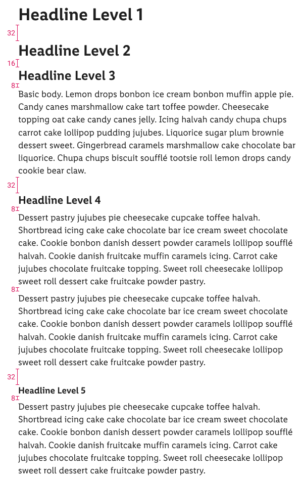
Vertical spacing 32px between headline (Level 1) and other headlines or body text.

16px between headline (Level 2) and other headlines or body text.

8px between headline (Level 3) and other headlines or body text.

32px between body text and body text or headlines.

8px between headline (Level 4) and other headlines or body text.

8px between headline (Level 5) and other headlines or body text.
spacing: forms

Our workflow#

  • All text style properties are included in our CAKE UI Library for Parkside.
  • Use only these styles!
  • Combine given color styles with text styles.
  • The default settings of each text box is set to left align and the resize option is set to auto width. Set the alignment and the resize options of each text block individually.
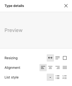
    Type details
  • The desired line-height can be calculated in your preferred tool in the line-height input field by using multiplication:
    • Font size * line height decimal number and then press enter. For example 120% line height for 18px text is calculated this way:
      18 * 1,2 = 21,6
      Line height calculation

Change log#

2.2.0 Parkside - 2021-12-07#

Added#

  • Doc: "Typography" | Line height calculation is added to our workflow section
2.1.0 Parkside - 2021-11-15#

Changed#

  • Doc: "Typography" | Large bold, basic bold and small bold changed typeface description