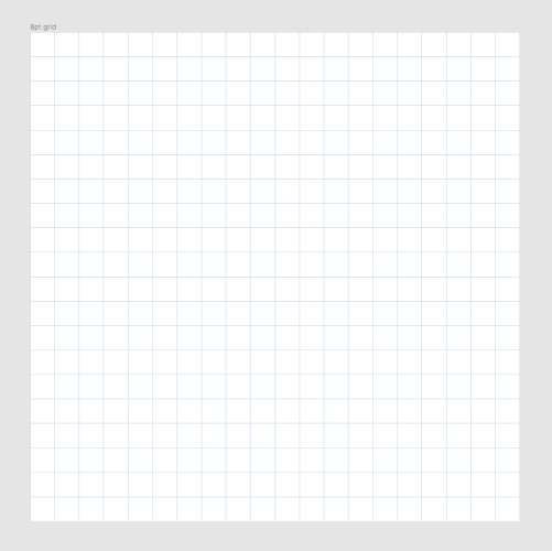
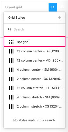
8-pt grid
Use increments of 8 to size and space out the elements on a page. This means that any defined height or width, margin or padding will be an increment of 8. Most popular screen sizes are divisible by 8 on at least one axis - usually both.
Why 8pts?#
- The variety of screen sizes and pixel densities has continued to increase making the work of icon and image generation more complicated for designers.
- The usage of an even number like 8 to size and space elements makes scaling for a wide variety of devices easy and consistent.
- Devices that have a 1.5x resolution will have a hard time cleanly rendering an odd number.
- Scaling 5px by 1.5x will result in a half pixel offset.
- It fits the frontend values of rem (16px).
All our layout resolutions fulfill this requirement:
| LG | MD | SM | XS |
|---|---|---|---|
1280x1024px | 960x600px | 600x960px | 320x568px |
What is the value?#
| Designer | Team | User |
|---|---|---|
| Efficiency, less decisions to make while maintaining a quality rhythm between your elements. | A perfect system of communication between designers and developers. A developer can easily identify an 8pt increment instead of having to measure each time. | Consistent aesthetic to the brand they trust. No blurry half-pixel offsets on their preferred device. |

