Top bar
Both Android and iOS top bars contain content and show actions to the user regarding the current screen. They contain titles, navigation, possible user actions and offer possibilities for branding.
Principles#
- They always appear at the top of each screen and can in some cases disappear upon scrolling.
- They act as a guide for the user by helping with navigation inside the app.
- They always have a consistent position which increases familiarity – the user always knows where to find them.
Anatomy#
Android#
Status bar
Left icon
Title
Space for icons
iOS#
Status bar
Left icon
Title
Space for icons or a text button.
Divider (hairline)
Overall styling#
Android#
- The title uses the text-style large bold.
- The line-height is 120%.
- The icon con size is 24x24px.
- Title text has always one line.
- Elevation shadow is always 1dp.
iOS#
- The title uses the text-style basic bold.
- The line-height is default.
- The icon con size is 24x24px.
- Divider at the bottom has 0.5px width.
- Title text has always one line.
Variants#
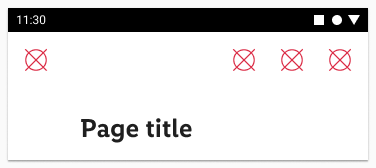
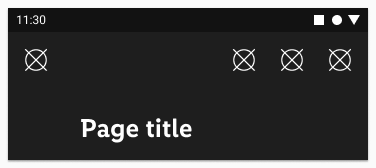
- Android and iOS top bars are available in standard and extended sizes and support both light and dark mode.
Android variants#
iOS variants#
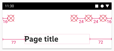
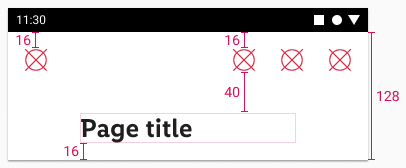
Spacing & measurements#
Android spacing#
| Type | Size | Preview |
|---|---|---|
| horizontal spacing | standard |  |
| vertical spacing | standard |  |
| horizontal spacing | extended |  |
| vertical spacing | extended |  |
iOS spacing#
| Type | Size | Preview |
|---|---|---|
| horizontal spacing | standard |  |
| vertical spacing | standard |  |
| horizontal spacing | extended |  |
| vertical spacing | extended |  |
What can be modified?#
- Override the text and icons.
- Remove icons if not needed.
- Adjust the width.
Our workflow in Figma#
- Use the option in layers panel to unhide/hide the layers for buttons (iOS only) and icons according to your needs.


