Cards
Preview#
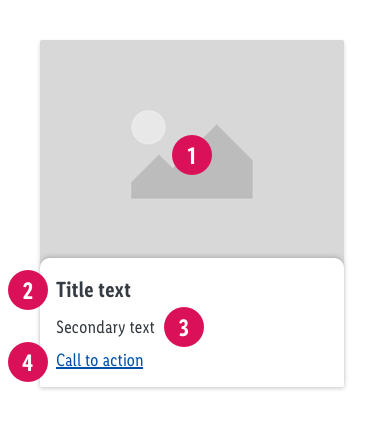
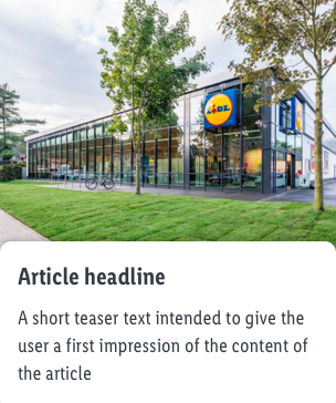
 Card image#
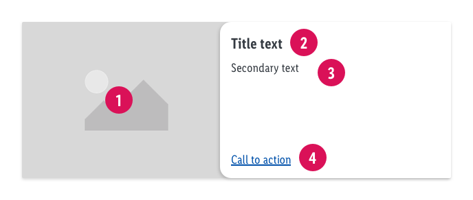
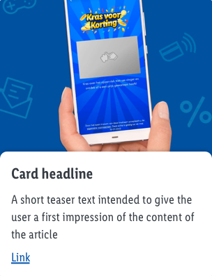
 Card image#
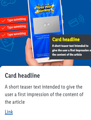
- don’t put the title text on the image or asset – use the according space for it
- image should represent the topic – choose the best fitting image according to the topic not the most asthetical one
- use high quality images
- consider the different resolutions of devices in order to display always „sharp“ images
- avoid images with a lot of small details
- stick with one image style
- don’t use product images (a card is not a product tile)
- "alt tag" should be choosen according to the image/main message (based on the according card, not based on the section head)
 Title text#
 Title text#
- users don't want to read and usually don't have much time – so be as short and understandable as possible
- use a short title text
 Secondary text#
 Secondary text#
- provide a brief summary of what to expect after click / tap
 Call to action (link)#
 Call to action (link)#
- provide a short link text
- text should describe the action e.g. „read more“, „discover more“, etc.
- stick to one link text to discribe one action, don’t use different wordings for the same action
Examples of use#
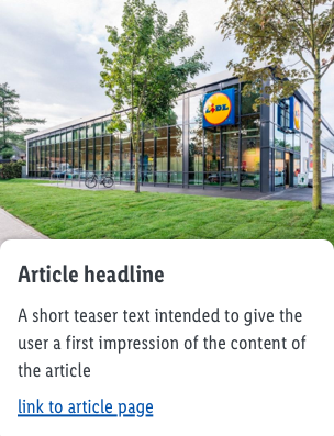
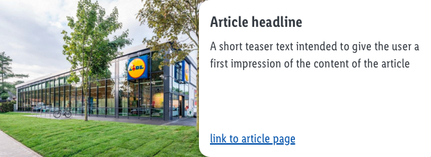
- This component should contain of an image, an article headline and a short teaser with a link to an article page.
- The short teaser text should provide the user with a first impression of the content of the article.
- Always use a text link whenever a redirect to another Landinpage should happen.
Recommendations of Use – Do's and Don'ts#
Cards as clickable element#
How to handle Images & Text#
Accessability, WCAG#
All elements and ingredients of the Card component must fulfill the guidelines of the WCAG
SEO-Requirements#
Title = H2; 500 characters (Optional) Claim = H3; 48 characters (required) Sub claim = Text; 265 characters (optional) Link = optional
Subheadings should be used as logically as possible. So If you setup a title for the card component please consider that the title is an H2 and the Claim is an H3. Make sure that the card component links to important and all-time available subcategories (Level 3 and below) or landingpages if possible. This is important to keep the user in the Lidl cosmos and to direct the link juice to important pages.
Image#
- To optimize page speed, keep the image size small
- Do not put relevant text on images, this could not be crawled by search engines
- Use an alt tag to describe the content of the image (not available at the moment)
Source references#
- nngroup.com/articles/cards-component/
