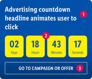
Coundown section
Component Description#
A Countdown section can be helpful to push your website visitors to take action. If this element is used in a propper way it can help increasing important KPIs.
If a (flashing) countdown clock indicates that a sale is about to end it activates the powerful loss-aversion instinct in users, and the flashing is very difficult to avoid attending to.
Better signal to users is showing a countdown when something exciting is about to start
component preview#
 Countdown headline#
 Countdown headline#
- Make sure the headline gives the user a first impression about what to expect.
- Avoid headlines that only contain one word or are too vague to understand the content.
 Counter#
 Counter#
 Button#
 Button#
Recommendations of Use – Do's and Don'ts#
| Countdown section Do's | Countdown section Don'ts |
|---|---|
|
|
Source references#
nngroup.com/articles/animation-purpose-ux/


