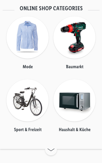
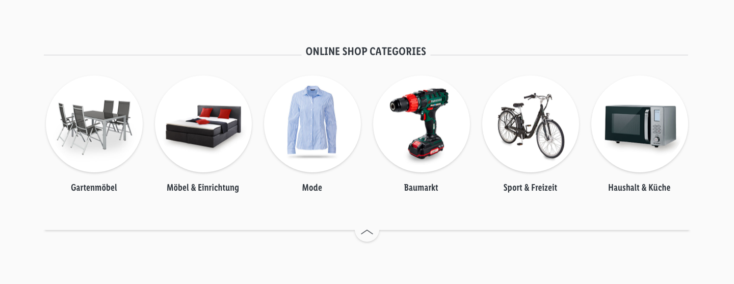
Category overview
Preview#
Description#
Recommendations on how to implement:#
When choosing which category bubbles to be displayed and in which order please focus on sorting and displaying the online shop categories according to traffic and order value. Focus on online shop categories that distinct from thematic resources and guides (categories should be placed first to boost conversion!). Take into account seasonal differences and adjust categories accordingly. Regarding Color scheme we recommend using one uniform color, preferably light grey/white. Category title should be short and concise and in capital letters.
Recommendations of Use – Do's and Don'ts#
Contrast
| Dos | Don'ts | |
|---|---|---|
| Image | 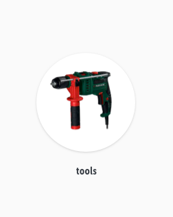 | 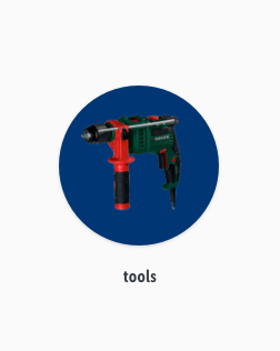 |
| description |
|
|
Clear product image
| Dos | Don'ts | |
|---|---|---|
| Image | 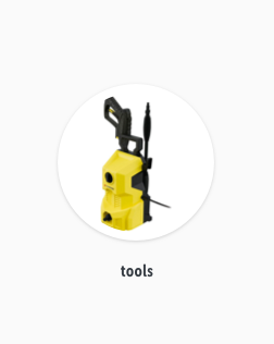 | 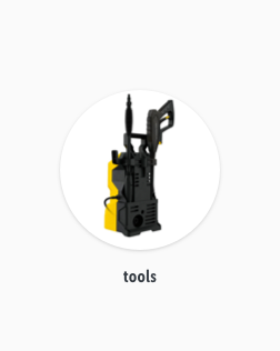 |
| description |
|
|
Product title
| Dos | Don'ts | |
|---|---|---|
| Image | 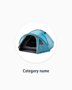 |  |
| description |
|
|
Source references#
- Analysis Category Overview & order of 1st level navigation OS
