Grid teaser
Component Description#
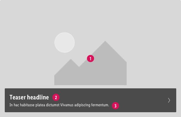
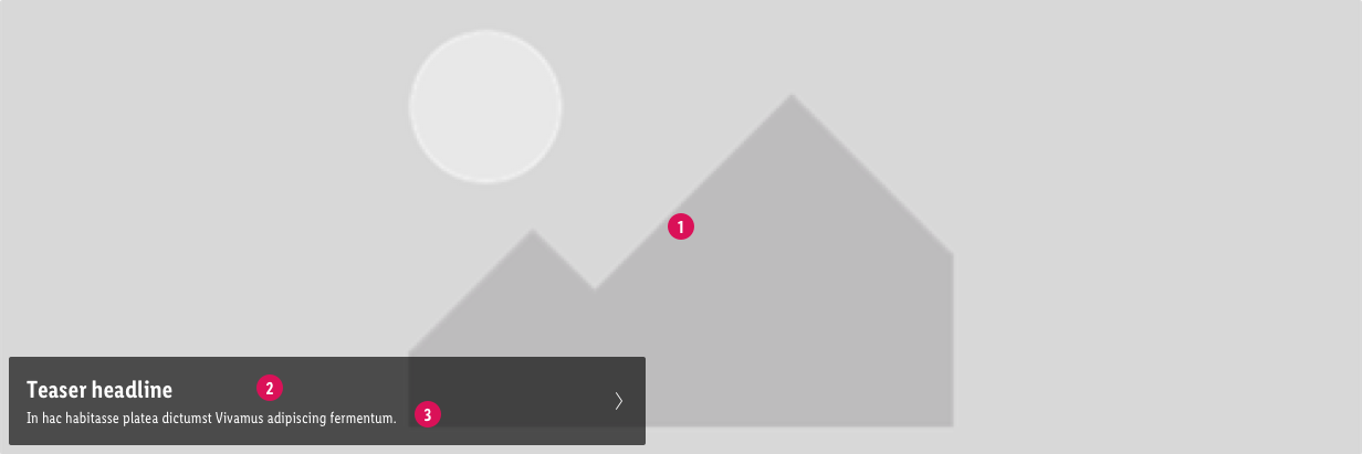
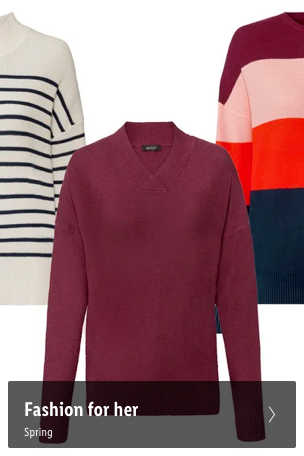
Grid teaser are internal ads for promoting deeper view of Lidl's assortment. Internal graphics like the grid teaser component can – when linking to relevant content – be immensely helpful to users. When Grid teasers are placed within a product list it should be handle with care. Users tend to interpret it as the end of the list.
component preview#
1x1 Teaser#
2x1 Teaser#
4x1 Teaser#
 Grid teaser image#
 Grid teaser image#
 Grid teaser headline#
 Grid teaser headline#
 Teaser copy text#
 Teaser copy text#
Recommendations of Use – Do's and Don'ts#
Grid teaser usage#
| Grid teaser Do's | Grid teaser Don'ts |
|---|---|
|
|
Image & Text#
SEO-Requirements#
Recommendation: if possible, use Grid Teaser to link to existing categories (/h/-directory). This ensures that permanent category-assortment profits from campaign-linkjuice and traffic.
Accessability, WCAG#
All elements and ingredients of the Grid teaser component must fulfill the guidelines of the WCAG
Source references#
- baymard.com/blog/avoid-these-ecommerce-graphics
- Evaluation of customer survey - Hero Teaser


