Alerts
Different types of notifications with contextual feedback about user actions as well as permanent presentation of important information.
Recommendations#
- Keep the alerts text as short as possible. Especially the title.
- Use an alert, i.e for feedback, recalls or support.
- Use links in the alert with caution. It might be more appropriate to link the entire alert instead of one word.
Overall styling#
- The text-style is large bold for the title and basic for the text.
- The line-height for the "alert title" is 120%, it stays 140% for the "alert text".
- Every variant uses basic-white as background-color.
- The border has a thickness of 1px.
- All widths are individually adjustable and fit into the layout columns and the 8-point-grid.
- The height depends on the content and the additional components shown.
- Every alert comes with the icon "cross.svg" as "close"-icon in the right upper corner.
- The color of the icon "cross.svg" stays the same in the focus/hover state. Only the cursor changes to pointer.
Title & icon#
- Some alerts come with an additional fixed icon to emphasize their meaning.
Text#
- Simple alerts to only display text.
Link#
Some alerts use links to direct the user to another page.
- Every variant uses the basic-white as text-color.
- In the default/hover/focus state the text-decoration is underline.
| State | Attributes | Preview |
|---|---|---|
| Default / visited |  | |
| Hover / focus | cursor: changes to pointer |  |
| Active / pressed | text-decoration: none |  |
Spacing & measurements#
| Types | Attributes | Preview |
|---|---|---|
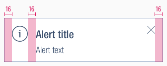
| Horizontal spacing | padding: 16px |  |
| Vertical spacing | padding: 16px margin-bottom: 8px |  |
| Icon size | meaning: 32x32px close: 16x16px |
What can be modified?#
- Override the text and icons.
- Adjust the width and height according to the content.
- Modify alerts to your project needs by adding other symbols or styles (i.e. like dividers or links).
Our workflow in Sketch#
- Use the „Overrides“-function to select the required variant, to edit the content, to change the icon if necessary or if the alert can’t be closed.
Change log#
Changed#
Doc: "Alert" | Clean up the documentation for the right structure and sentence case
Fixed#
Doc: "Alert" | Preview example images have been fixed
Changed#
- "Alert" | Changed symbols: with layer-style settings
Added#
- "Alert" | Added description: line-height


