Key visual
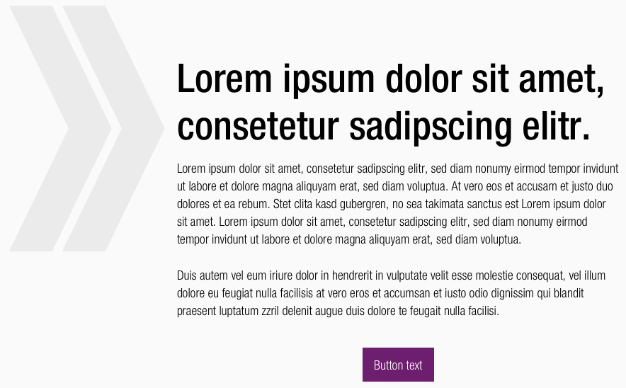
The key visual is an illustrative sign to emphasize individual content.
Recommendations#
- Please keep in mind that this element is just a decorative element.
- It can be used as a highlight element before texts or free in the layout.
- This element is intended for restrained use and isn't be used as a pattern.
- The decorative element can be used for placative sections.
- Please coordinate applications with the SCHWARZ brandmangement.
Overall styling#
- The shape can be filled within any basic-, brand-primary-base-, gray-color.
- The element can only be scaled proportionally.
- There is no outlined keyvisual available.
Spacing & measurements#
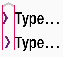
- In combination with a text, the height of the key visual is based on the verse height of the text.
| Types | Attributes | Preview |
|---|---|---|
| Height | x-height of the text element |  |
| Distance | optically aligned |  |
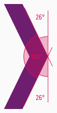
| Angle | Outer angle: 26° Inner angle: 128° |  |
Examples#
What can be modified?#
- Override the color.
- Adjust the size proportionally.
Our workflow in Sketch#
- To individualize the decorative key visual in your product you need to detach/unlink the complete symbol from the CAKE UI Kit.
- Used the element specifically and scale the single symbol to the right width or height.
Change log#
Changed#
Doc: "Key visual" | Clean up the documentation for the right structure and sentence case
Changed#
- "Key visual" | Changed symbol: with layer-style settings
