Header
The header is one of the essential components to create brand awareness.
The appearance demonstrates visitors that they are on a SCHWARZ page now. Its strongest supporting element is the SCHWARZ enterprise logo.
Recommendations#
- Keep the globally known SCHWARZ enterprise logo in the header.
- Try to display all navigation items with one short and concise keyword.
- Don't show more than five user-navigation elements (including the search icon in desktop and tablet).
- Please implement a search-function icon as the first user-navigation element from the right.
Elements#
- The structure of the header is modular.
- It is a group of symbols and typography from the SCHWARZ Fundamentals and SCHWARZ Web Kit.
- If you combine the individual elements in Sketch, you get the header in various forms and for each breakpoint.
- There is a collapsed on-scroll layout for our desktop and tablet (landscape) breakpoints.
- There is a separate header layout for tablets (portrait) and smartphones that opens a dropdown menu with the main- and sub-navigation over a burger-menu icon.
- The header contains the logo, typography: main-, sub-, brand- and user-navigation, as well as colors and shadows.
Desktop & tablet landscape (LG & MD)#
Extended#
Collapsed: Main#
Collapsed: Sub#
- Logo
- Brand-navigation
- Language
- User-navigation
- With integrated search
- Main-navigation
- Sub-navigation
Tablet portrait & smartphone (SM & XS)#
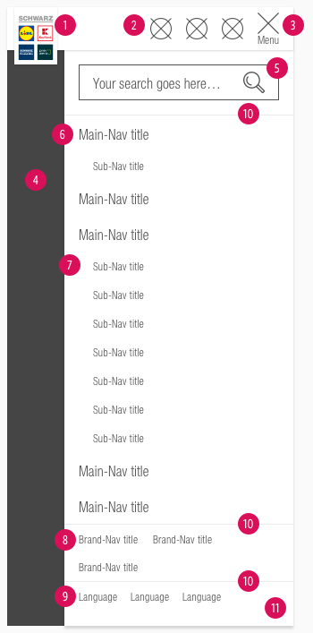
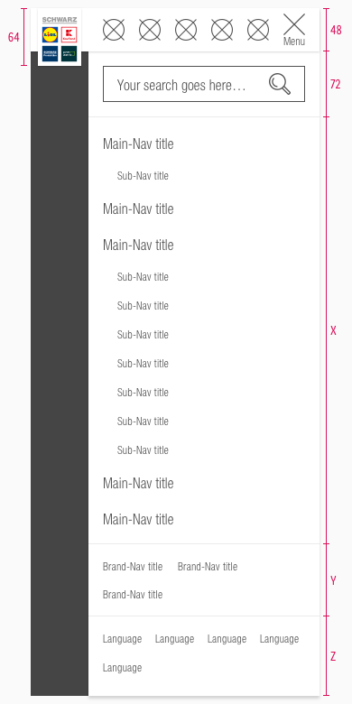
- Logo
- User-navigation
- Burger-menu
- Overlay
- Search field (if it exists)
- Main-navigation
- Sub-navigation
- Brand-navigation
- Language
- Dividers
- Flyout
Overall styling#
- The letter spacing of every character is 0.2px.
- The line-height of every text is 120%.
- The header comes with a background-color in basic-white.
- It uses the shadow-default.
- The dividers in tablets (portrait) and smartphones have a 1px thickness and use gray-lightest as color.
- The sub-navigation is positioned on the websites background but belongs to the complete header component.
- The search-field uses our input-field states with the "magnifier.svg" as icon.
- Every text is horizontally aligned to the height.
Logo#
- The Logo comes in different sizes depending on:
- the device
- the extended or collapsed (on-scroll) mode for desktop and tablet (landscape).
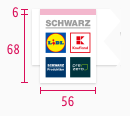
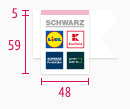
- It is placed on a supporting area in basic-white that uses the shadow-default.
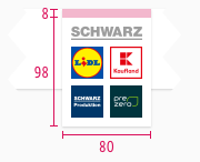
- Please regard the logo extension description because of the logos position close to the screen border.
Brand-navigation#
- Some SCHWARZ sub-brands have special pages to present their company (e.g. Twogo, Dieter Schwarz Stiftung, …).
- The text-style is small.
- The indicator is displayed only in the hover/focus state.
- The length of the indicator is based on the entered text.
- A click on this navigation item opens a new tab in the user's browser.
| Types | Attributes | Preview |
|---|---|---|
| Default | text-color: gray-dark |  |
| Hover / focus | text-color: basic-black indicator: basic-black |  |
Language#
- This selection is required by countries that offer a SCHWARZ sub-brand website in different languages.
- The text-style is small.
- The default state always shows the current language. It changes to another language after a new selection.
| Types | Attributes | Preview |
|---|---|---|
| Default | text-color: gray-dark |  |
| Hover / focus | text-color: basic-black indicator: basic-black |  |
Main- & sub-navigation#
- There are different types of usage for each section of the navigation.
- Use the main-navigation for main topics that the SCHWARZ sub-brand has to offer.
- Use the sub-navigation if a main topic has subitems.
- The sub-navigation is only displayed if the main-navigation is active.
- The indicator is displayed in a different color for the hover/focus or active state.
- The length of the indicator is based on the entered text.
- Its position is at the bottom of the element.
Overall styling (LG & MD)#
- The text-style for main-navigation is basic.
- The line-height is set to default.
Extended#
- The text-style for sub-navigation is small.
| Types | Attributes | Preview |
|---|---|---|
| Default | text-color: gray-dark |  |
| Hover / focus | text-color: basic-black indicator: basic-black |  |
| Active | text-color: brand-primary-base indicator: brand-primary-base |  |
Collapsed#
- The text-style for sub-navigation changes to basic.
| Types | Attributes | Preview |
|---|---|---|
| Default | text-color: gray-dark |  |
| Hover / focus | text-color: basic-black indicator: basic-black |  |
| Active | text-color: brand-primary-base indicator: brand-primary-base |  |
Overall styling (SM & XS)#
- The text-style for main-navigation is basic.
- The text-style for sub-navigation is small.
- The line-height is set to default.
- The length of the indicator starts at beginning of the component.
- Its position is at the bottom of the element.
| Types | Attributes | Preview |
|---|---|---|
| Default | text-color: gray-dark | 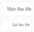 |
| Hover / focus | text-color: basic-black indicator: basic-black | 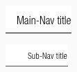 |
| Active | text-color: brand-primary-base indicator: brand-primary-base | 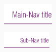 |
User-navigation#
- This area is for user guidance with the support of icons.
- The most important elements for the user should be placed here (e.g. login, account, search …).
- It uses the badge-addon to display a counter.
Burger-menu#
- Use this element only for tablets (portrait) and smartphones to demonstrate all navigation elements.
- In contrast to the user-navigation, a "menu"-text is shown.
- The text-style is always small.
- It uses our "bars-horizontal.svg" icon to display a burger-menu.
- The burger changes to our "cross.svg" icon as a close-function.
| Types | Attributes | Preview |
|---|---|---|
| Default | text-color: gray-dark icon-color: gray-dark |  |
| Hover / focus | text-color: basic-black icon-color: basic-black |  |
| Active | text-color: gray-dark icon-color: gray-dark |  |
Flyout#
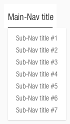
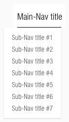
- The main-navigation and language selection on desktop and tablet (landscape) show a flyout on hover with all possible options.
- It comes with a background-color of basic-white.
- It uses shadow-default.
- It is located directly under the indicator of the hover state.
| Types | Attributes | Preview |
|---|---|---|
| Default | text-color: gray-dark | 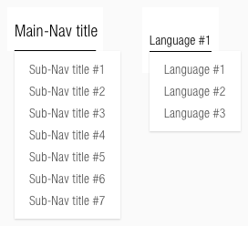 |
| Hover/focus | text-color: basic-black indicator: basic-black | 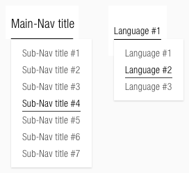 |
Spacing & measurements#
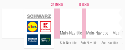
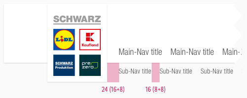
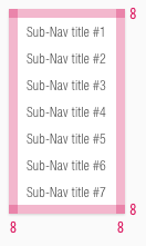
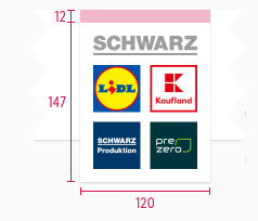
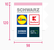
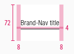
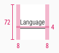
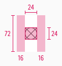
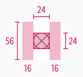
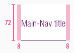
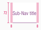
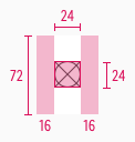
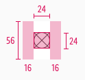
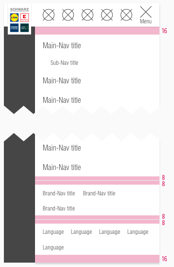
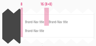
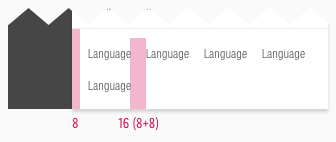
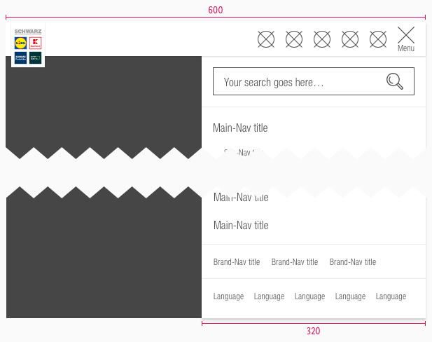
- This section shows the different spacings of the desktop, tablet and mobile elements included in the header.
Desktop & tablet landscape (LG & MD)#
- All the spacing for these breakpoints and extended or collapsed mode are identical.
- Only the height and width of the used components are different.
Spacing#
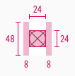
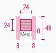
Measurements#
Extended#
Collapsed#
Tablet portrait & smartphone (SM & XS)#
Spacing#
- All the spacing for these breakpoints are identical.
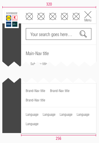
Measurements#
Position#
Behavior#
On-scroll#
- The header resizes in desktop and tablet (landscape) with an on-scroll effect - as given in our examples on the top of this description.
- There are two different behavior for the resizing depending on the navigation items shown.
Main- & sub-navigation#
- If the first scroll-down interaction is triggered, the whole header gets in its collapsed mode.
- If the first scroll-up interaction is triggered, the whole header gets in its extended mode.
- The animation of all elements starts with a global transition.
- If a sub-navigation exists all main-navigation items are hidden.
- Each menu item is clickable and the corresponding menu default page is loaded.
- If a menu item does not have a separate default page, the content of the first sub-nav page is displayed.
Recommendations#
- We checked some settings for the transition that are given in the table below.
| Settings | Duration | Delay | CSS attribute | Bezier |
|---|---|---|---|---|
| Scroll down (Collapsed) | 0.6s | 0.15s | presets ease in & out | 0.64, 0.04, 0.35, 1 |
| Scroll up (Extended) | 0.4s | 0s | custom presets | 0.59, 0.06, 0.4, 0.95 |
Overflow menu "More"#
- The last main- or sub-navigation item is displayed as an overflow menu named "more..." if too many items should be presented than the possibility to show them.
- The keyword "more..." is only a recommended example and can be retitled to any appropriate term (i.e. "others…").
- The more menu is treated like a main-nav item. The items inside the overflow menu behave like sub-nav items.
Flyout#
- The main-navigation shows a flyout with all subitems on hover to grant a direct access for the user.
- Ends 40px from browser bottom edge or 8px from sticky bar.
- Maximal width is 33% of viewport width.
- Text breaks into multiple lines when maximal width is overreached.
- The alignment of the flyout depends on the positioned main-menu item.
- Therefore, the alignment can be left or right on the indicator.
- On mobile devices, the flyout is triggered on hold-tap and is visible until a sub-navigation is selected.
- The flyout on focus state is triggered by pressing Enter. To navigate through the elements, use the tab key or the up/down arrow on the keyboard.
- A flyout element is to be used exclusively in the main-nav.
Examples#
- Clicking on the magnifier icon opens an active input-field that overlays the whole upper section (brand-, user-navigation and language selection) of the header.
- In collapsed mode, the main-navigation fades out completely and only the search field is shown.
What can be modified?#
- Override the text and icons.
- Adjust the width of single symbols according to the text.
- Adjust the height if you delete navigation sections (i.e. main- or sub-navigation).
- Modify headers for your project needs by deleting single symbols or special sections (i.e. language or user-navigation section).
Our workflow in Sketch#
- To individualize the header in your product you need to detach/unlink the complete symbol from the SCHWARZ CAKE UI Web kit.
- Fill it with realistic content and scale every single symbol to the right width or height.
Change log#
Deprecated#
Doc: "Header" | added deprecation warning to documentation page
Added#
Doc: "Header" | Added text-style information for language navigation
Changed#
Doc: "Header" | Clean up the documentation for the right structure and sentence case
Changed#
Doc: "Header" | Updated flyout description
Added#
- "Header" | Added behavior description for main-navigation and flyout (focus)
Changed#
- "Header" | Changed symbols: with layer-style settings


