Tables
Tables are texts in several columns and rows.
In our case, only rows are separated by a horizontal divider. The use of background colors is an additional distinction.
Overall styling#
- The text-style is basic or basic-bold for headlines.
- The line-height is set to default.
- The font-color is basic-black and for headlines brand-primary-base.
- Content dividers have gray-lighter as color and a 1px thickness.
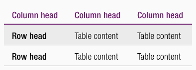
- Column header dividers have brand-primary-base as color but a 2px thickness.
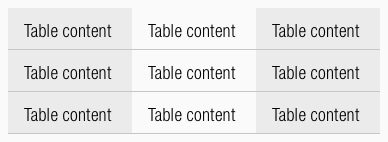
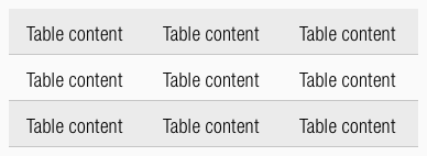
- The background-color for a table in zebra look is always gray-lightest, it stays in a transparent look if theres is no background-color desired.
General#
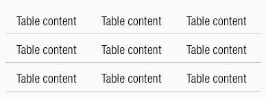
There are different kinds of tables.
Simple table#
- Just a simple table with no special styling or layout.
Table with headers#
- Column-head differs visually in text-style and divider.
- Row-head differs visually in text-style.
Table with vertical background#
- The background color changes in every odd column (e.g. 1, 3, 5, 7,…).
Table with horizontal background#
- The background color changes in every odd row (e.g. 1, 3, 5, 7,…).
Special behavior#
- The table can be scrolled vertically and horizontally for tables that are wider than the viewport.
- A zoom function can be added for smaller devices.
- The font size depends on the size of the body text.
- In some cases, a different font size can be used.
Spacing & measurements#
Our workflow in Sketch#
- There are symbols in our library to layout tables.
- Each table must be created independently.
- The different „Overrides“-functions help here.
Change log#
Changed#
- "Table" | Changed symbol: with layer-style settings
- "Table" | Changed symbols and description: added optional background-color to "row head" and "table content"
Changed#
- "Table" | Changed description: overall styling for headlines


