Buttons
A button should lead the user to a certain action. Unique labels give the user a clear message which action is exactly triggered.
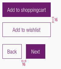
The actions can be separated into two buttons. The design of two different buttons shows the user a visual distinctions which action is needed to fulfill his task. Visually separating the primary and secondary buttons also helps to draw the attention of the user on a certain action.
Recommendations#
Do's#
- The secondary button can be used without the primary button.
- Keep the text short and use as few words as possible.
- Always use a specific call to action text.
- Choose a unique button labeling to send a clear message which action is exactly triggered by the button.
- Ensure consistent labelling across the user journey.
- Be sure to allow enough space for translation into other languages.
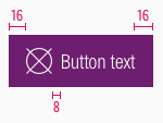
- A button with an icon may only be used in combination with an input field.
Dont's#
- Do not use more than two buttons below each other.
- Avoid exclamation marks.
Hint! You can use links as an alternative to a button to offer the secondary action.
Types#
- You can use different types of buttons: label, label with icon, icon.
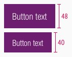
- The different breakpoints have different buttons sizes.
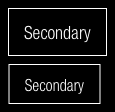
- Each button level is available in a positive and a negative version – this allows you to layout on a light or dark background.
Primary#
- Our primary button is also our Call-to-Action (CTA) button.
- It only should be used once per page.
- It gives the user a hint to fulfill his task.
- It's used to guide the user into taking certain actions.
- It usually invites users to sign in, register, purchase, etc.
- It is used to strongly suggest something that "we" want the user to do in first place.
Secondary#
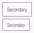
- Use our secondary button if you want to show more than one button.
- It should only be used in conjunction with the primary button.
- It is offered to show the user a supporting task.
- It isn't as important and shouldn’t call as much attention as the Primary/CTA.
- Normally secondary buttons can be used more than once per page.
- It offers users an alternative to the Primary/CTA (e.g. "back" instead of "next"; "add to wishlist" instead of "add to cart"; "edit", "delete", etc.).
- It leads the user away from his primary task or forwards to subpages of the website.
Overall styling#
- The text-style is button-text.
- The line-height is set to default.
- Secondary buttons have a outline with a 1px thickness.
Positive#
Primary#
Secondary#
Negative#
Primary#
Secondary#
Spacing & measurements#
Change log#
Changed#
Doc: "Button" | Clean up the documentation for the right structure and sentence case
Changed#
- "Button" | Changed symbols to new smart layout of Sketch


