Typography
It helps you to present your design and content as clearly and effectively as possible according to the SCHWARZ standard.
Helvetica Neue LT Pro#
- The Helvetica Neue displays the functional and objective style that was characteristic of fonts in the 1950s and 60s.
- The defined base color for all text-styles is basic-black.
- Use any color of brand-primary, brand-secondary, brand-info, brand-attention, gray, danger or success as text color as long as it has a high contrast ratio in interaction with backgrounds.
- All types of headings should primarily be used in single line scenarios.
- All text-styles are set to a letter-spacing of 0.2px.
- Capital letters are not allowed!
| Typeface | Text-style | Usage |
|---|---|---|
| Light Condensed | Small, Basic, Large, Button text | for body text, links, tables, lists, input-fields, etc. |
| Medium Condensed | Small Bold, Basic Bold, Large Bold, Headlines, Displays | for headlines, labels, highlights, etc. |
Small#
- The typeface is always light condensed.
- The line height is always 140%.
- Left, center, and right alignment are available for this font style.
Small bold#
- The typeface is always medium condensed.
- The line height is always 140%.
- Left, center, and right alignment are available for this font style.
Basic#
- The typeface is always light condensed.
- The line height is always 140%.
- Left, center, and right alignment are available for this font style.
Basic bold#
- The typeface is always medium condensed.
- The line height is always 140%.
- Left, center, and right alignment are available for this font style.
Large#
- The typeface is always light condensed.
- The line height is always 140%.
- Left, center, and right alignment are available for this font style.
Large bold#
- The typeface is always medium condensed.
- The line height is always 140%.
- Left, center, and right alignment are available for this font style.
Button text#
- The text-style is only used in the button component.
- The typeface is always light condensed.
- The line height is always 120%.
Headlines#
- The page headlines are displayed in 5 levels.
- All levels have different font sizes.
- There are fixed font sizes from level 5 to level 1.
- The typeface is always medium condensed.
- The line height is always 120%.
- Left, center, and right alignment are available for all headline levels.
Headline (Level 1)#
Headline (Level 2)#
Headline (Level 3)#
Headline (Level 4)#
Headline (Level 5)#
Displays#
- The display text-style is defined in 5 levels.
- All levels have different font sizes.
- There are fixed font sizes from level 5 to level 1.
- The typeface is always medium condensed.
- The line height is always 120%.
- Left, center, and right alignment are available for all display levels.
Display (Level 1)#
Display (Level 2)#
Display (Level 3)#
Display (Level 4)#
Display (Level 5)#
Lists#
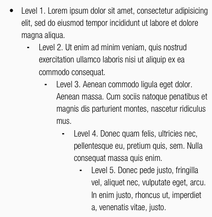
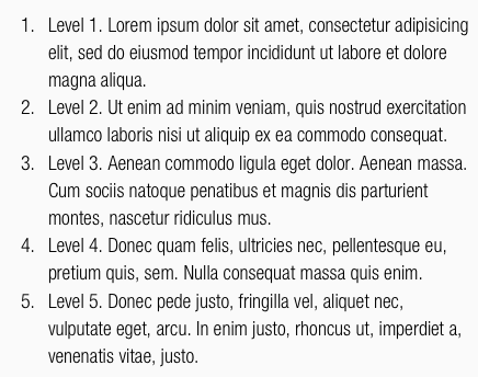
- Lists are used for text structuring.
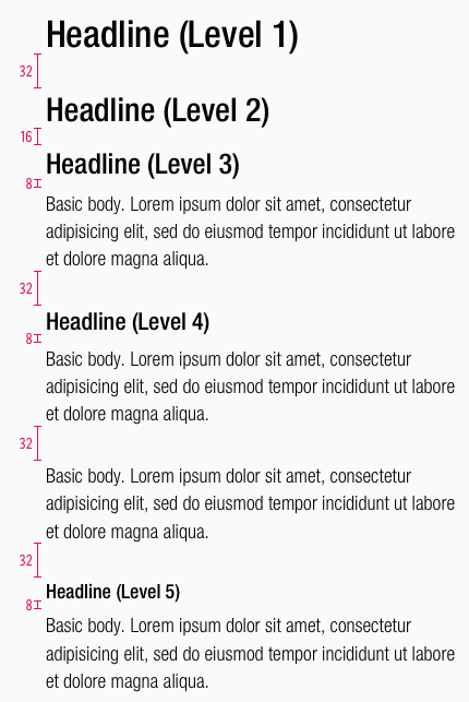
Spacing & measurements#
Our workflow#
- All text styles are included in our CAKE UI Fundamental file.
- With Sketch v51.2 text styles can always be linked to this document – Use only these styles!
The desired line-height can be calculated in your preferred tool in the line-height input field by using multiplication:
Change log#
Added#
Doc: "Typography" | Line height calculation is added to our workflow section
Changed#
Doc: "Typography" | Clean up the documentation for the right structure and sentence case
Added#
- "Typography" | Added text-alignment left, center, right: Small, Basic, Large, Display, Headline (LG & MD-XS)
- "Typography" | Added text-style: display 4-5 (LG & MD-XS)
- "Typography" | Added description: display 4-5 (LG & MD-XS)
Changed#
- "Typography" | Changed text-styles: set letter-spacing to 0.2px (LG & MD-XS)


