Banner
The banner element is mainly used to create a focus on a certain topic.
This focus is underlined with the help of a headline, text and image to give the user more information.
Recommendations#
- Keep the text short.
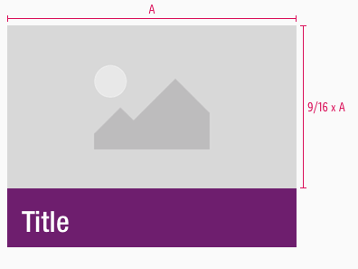
- The title in our tablet portrait and smartphone components shouldn't be longer than a maximum of two lines.
- Note that on SM-XS the body text is hidden.
Overall styling#
- The headline uses the text-style display 1.
- The line-height of the display text-style is set to 110%.
- The body-text comes in the text-style large.
- The line-height of the body-text is set to default.
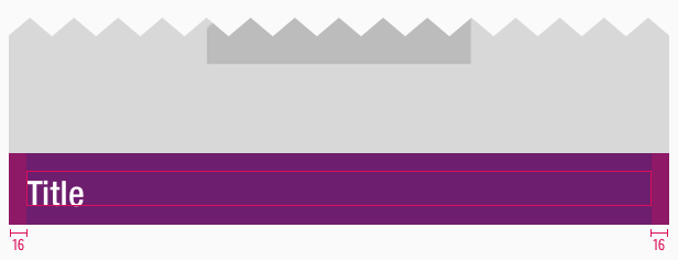
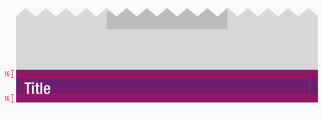
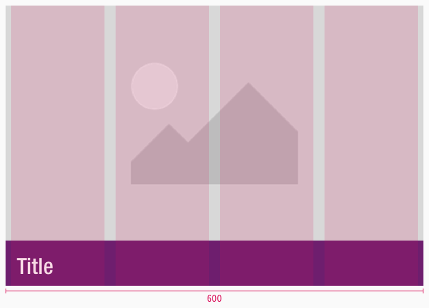
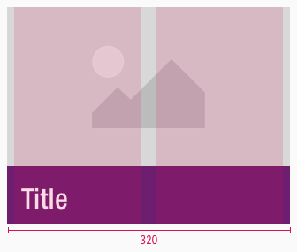
- There is no inverted variant for portrait tablet (SM) and smartphone (XS) breakpoints because the textual part always is placed under the image with a colored background.
- The picture is set to a 16:9 but can be adjusted to any preferred ratio.
- The text always is vertical centered on the plain color and never on an image.
- It has no hover or focus state.
Variants#
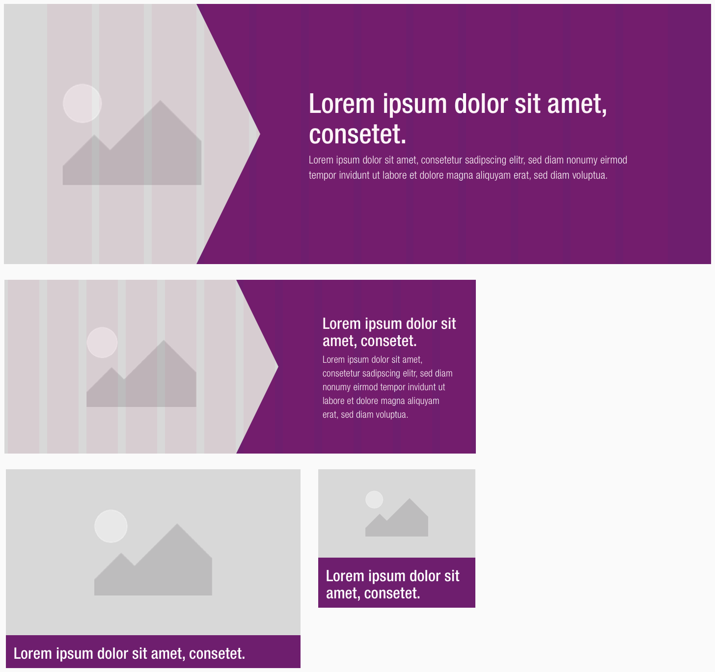
- The banner is available in default and inverted.
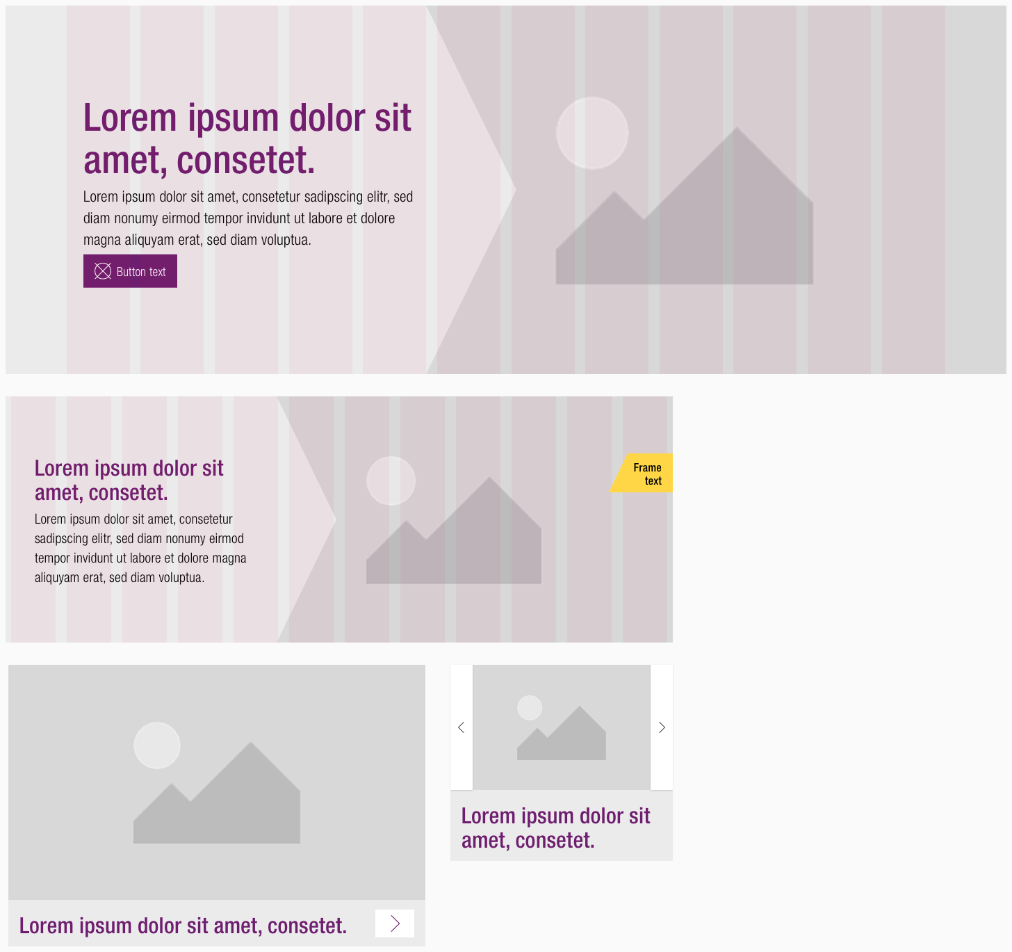
- It's further clustered into positive and negative.
Default#
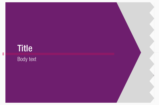
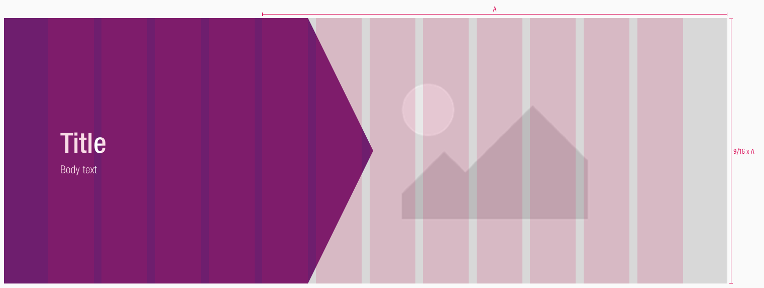
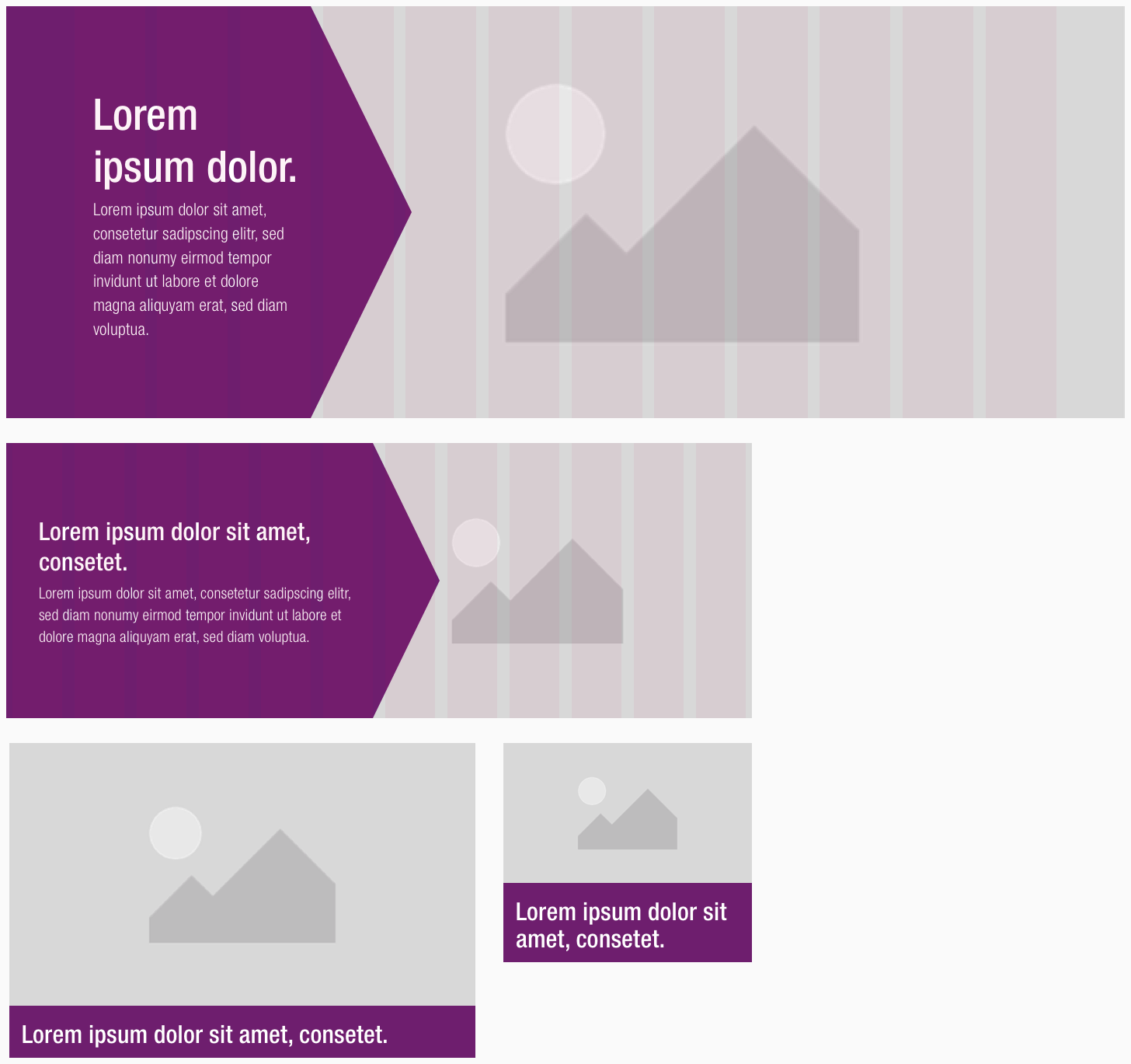
- The text is placed on the arrow element, the picture is situated behind it.
| Types | Attributes | Preview |
|---|---|---|
| Positive | text-color: basic-white background-color: brand-primary-base | 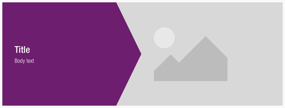 |
| Negative | text-color: brand-primary-base (headline), basic-black (text) background-color: gray-lightest | 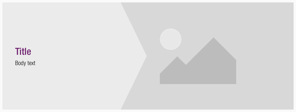 |
Inverted#
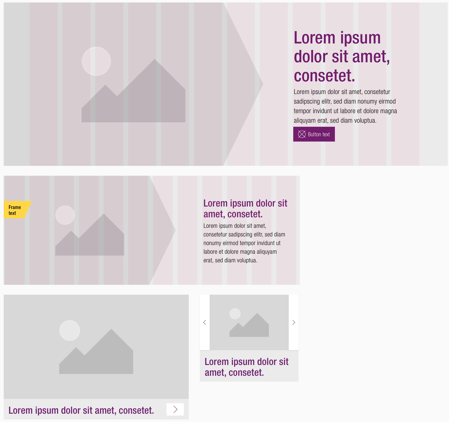
- The picture is placed in the arrow element, the text stays on its background.
| Types | Attributes | Preview |
|---|---|---|
| Positive | text-color: basic-white background-color: brand-primary-base | 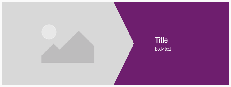 |
| Negative | text-color: brand-primary-base (headline), basic-black (text) background-color: gray-lightest | 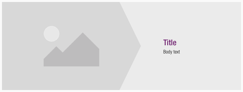 |
Possible adjustments#
- This adjustments mainly concern the components with an arrow element.
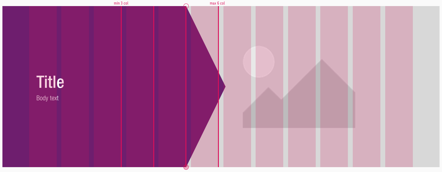
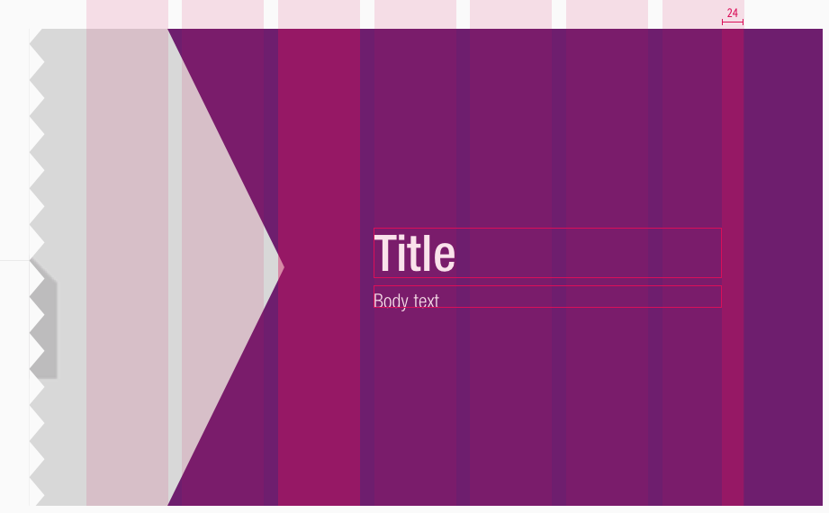
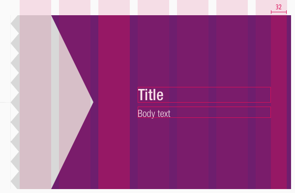
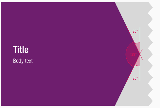
- The peak of the rectangle element can be positioned at minimum third column and maximum on the sixth column of the grid. The desired brand element is the result of the combination of the rectangle and the triangle element.
- Please pay attention that the rectangle doesn't take more than six columns and minimum three columns of the layout.
- There should be enough space for the textual part as well.
Spacing & measurements#
Spacing#
Measurements#
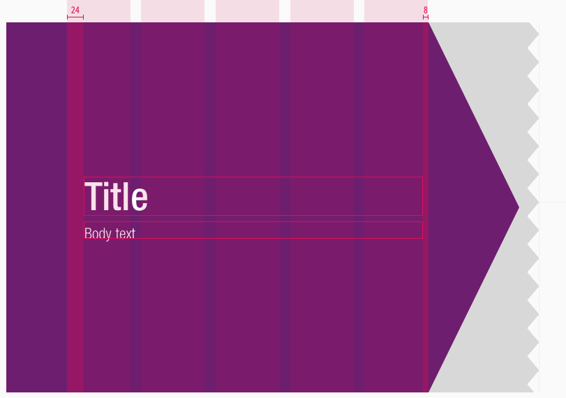
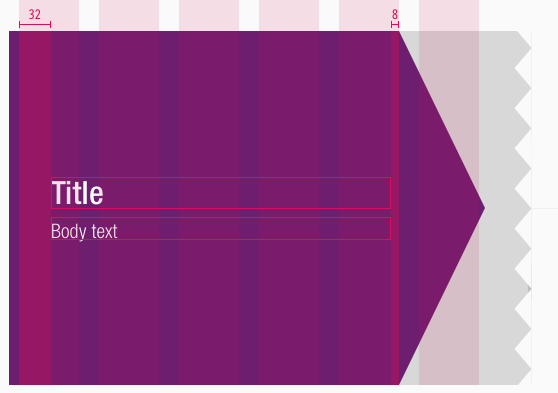
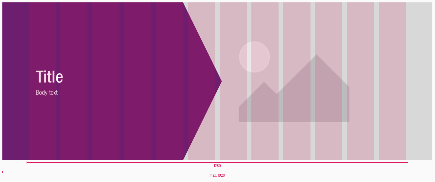
- The width of the symbol always adapts to the viewport – up to a maximum of 1920px.
Examples#
Overall#
Note:
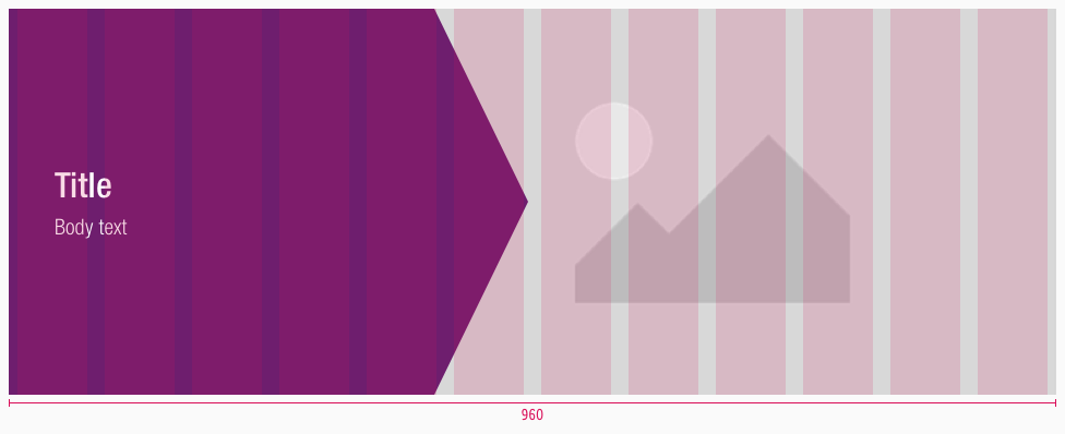
Depending on the design requirements, it is possible to use a different number of columns for the flat brand element on LG than on MD. This offers a creative freedom to present the content on different touchpoints in an optimal way.
Default positive LG-XS overview#
Inverted positive LG-XS overview#
Default negative LG-XS overview#
Inverted negative LG-XS overview#
What can be modified?#
- Override the text.
- Adjust the width of the branded arrow element and picture.
Our workflow in Sketch#
- Use the "Overrides"-function to customize your banner element (i.e. select the correct status you want to display).
Change log#
Changed#
Doc: "Banner" | Clean up the documentation for the right structure and sentence case
Added#
Doc: "Banner" | Added more detailed information to banner documentation
Changed#
- "Banner" | Changed symbols to new smart layout of Sketch
Changed#
- "Banner" | Changed symbols and description: set text-style for body-text from "basic" to "large" (LG)
- "Banner" | Changed symbols and description: set text-style for body-text from "shown" to "hidden" (SM & XS)
