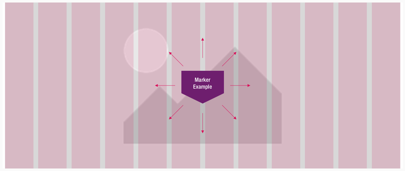
Marker
The marker component belongs - like bubble, corner and frame - to the group of flashes.
Use the different flashes to emphasize messages with a strong meaning.
Recommendations#
- All flash elements should be used sparingly to avoid overload.
- Please use the marker only for one to three words.
- When entering text, mobile view (MD-XS) should be taken into consideration first.
- When entering longer text, the element grows only in height and becomes multiline up to a maximum number of 4 lines (LG-XS).
- Too long text is truncated with ellipsis.
Overall styling#
- The text-style depends on the component and is always basic bold.
- The line-height is always 120%.
- The marker has no hover- or focus-state.
Variants#
- The marker element is available in different colors, which are subcategorized into: positive and negative.
| Types | Attributes | Preview |
|---|---|---|
| Primary (positive) | text-color: basic-white background-color: brand-primary-base |  |
| Attention (negative) | text-color: basic-black background-color: brand-attention-base |  |
Position#
- The marker element can be placed completely free in the layout.
Spacing & measurements#
| Types | Attributes | Preview |
|---|---|---|
| Horizontal spacing | 8px | 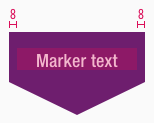 |
| Vertical spacing | padding-top: 16px | 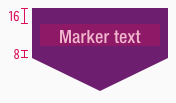 |
| Width | LG: 136px MD-XS: 120px | 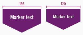 |
| Angle | inner angle: 128° outer angle: 26° | 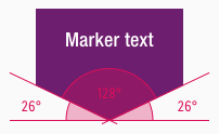 |
What can be modified?#
- Override the text.
- Modify marker to your project needs by resizing the symbol.
Our workflow in Sketch#
- Use the "Overrides"-function to change the text.
- Use the "Overrides"-function to change the background-color via layer-styles (this is only available in the positive variant).
- Detach the symbol for resize the element to your needs.
Change log#
Changed#
Doc: "Flash-Marker" | Clean up the documentation for the right structure and sentence case
Removed#
Doc: "Flash-Marker" | The height measurement is obsolete
Added#
Doc: "Flash-Marker" | New description for marker element
Changed#
Doc: "Flash-Marker" | Deleted Info (positive), Secondary (positive)
Changed#
- "Marker" | Changed symbols: with layer-style setting
Changed#
- "Marker" | Changed symbol and description: vertical spacing
- from "the text is always vertically centered" to "padding-top: 16px"
- "Marker" | Changed symbol and description: height
- from "40px" to "48px" (LG)
- from "36px" to "44px" (MD-XS)
- "Marker" | Changed symbol: naming
Removed#
- "Marker" | Removed symbols and description: small, large
